
Pandemics and Politics Project
Udi Sommer, PhD and Or Rappel-Kroyzer
PPP aims to quantify the relations between COVID-19 and political processes in the USA. Phase I of the project, presented here as a set of live figures, outlines how COVID-19 influenced the results of the presidential elections."
Figure 1: Indications for the Sudden Nature of the Repercussions of COVID-19
Figure 2: Workplace Mobility Change over the first 6 Weeks of COVID-19
Figure 3: Shrinkage in Ideology’s Effect over Time
Figure 4: Predicted Values for the Effect of Political Partisanship on COVID-19 Growth Rate
Figure 5: COVID-19 hotspots and election differentials
Figure 6: Variance between States in Usage of Vaccination Doses (May 2021)
Figure 7: Distribution of County-Level Vaccination Rates (May 2021)
Figure 8: Recalcitrant Counties and their Vaccination Trends (May 2021)
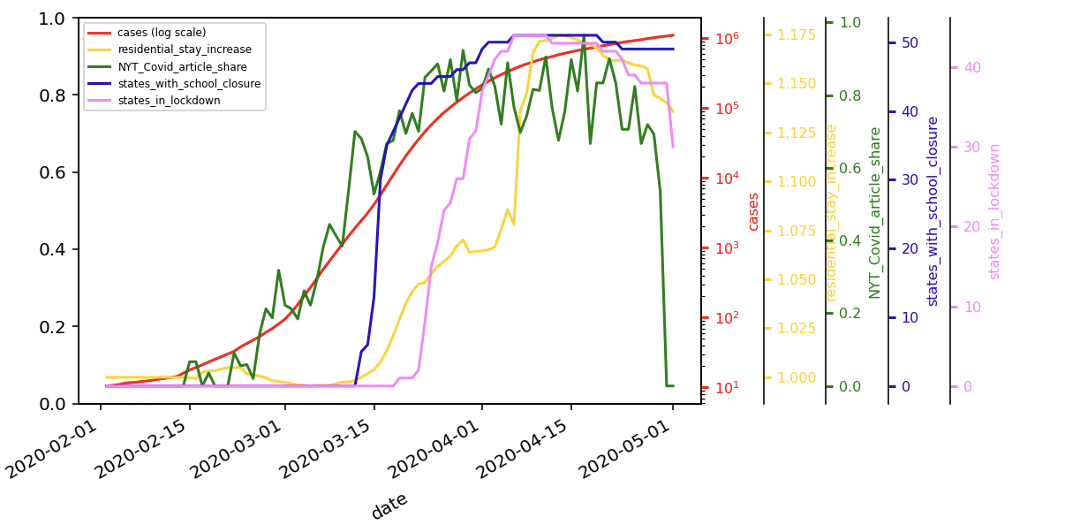
Figure 1: Indications for the Sudden Nature of the Repercussions of COVID-19. The overall number of cases (in log scale) denoting the pandemic spread (Red); the share of COVID-19 related articles out of the overall daily articles in the New York Times (U.S. and NYC-region sections) (Purple); the number of states imposing school closures (Yellow) and stay-at-home orders (Green); and the increase in time spent at home compared to 2/15/2020 (Blue).
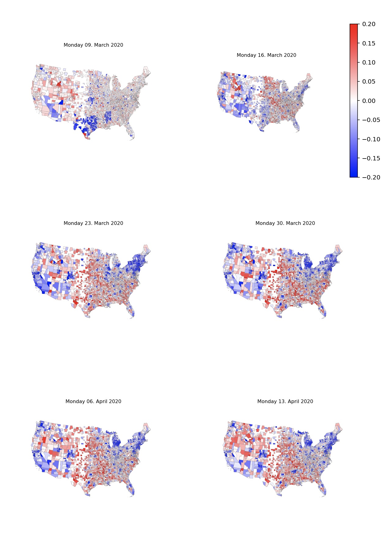
Figure 2: Workplace Mobility Change over the first 6 Weeks of COVID-19. larger decrease in workplace mobility (i.e. more people avoided going to work) is indicated by blue hues. Red hues indicate smaller decrease in workplace mobility than the baseline average. The six maps indicate the geographic disparity of mobility change over March and early April. Mobility is normalized so that each county is colored according to difference from average mobility index of that day over all counties.
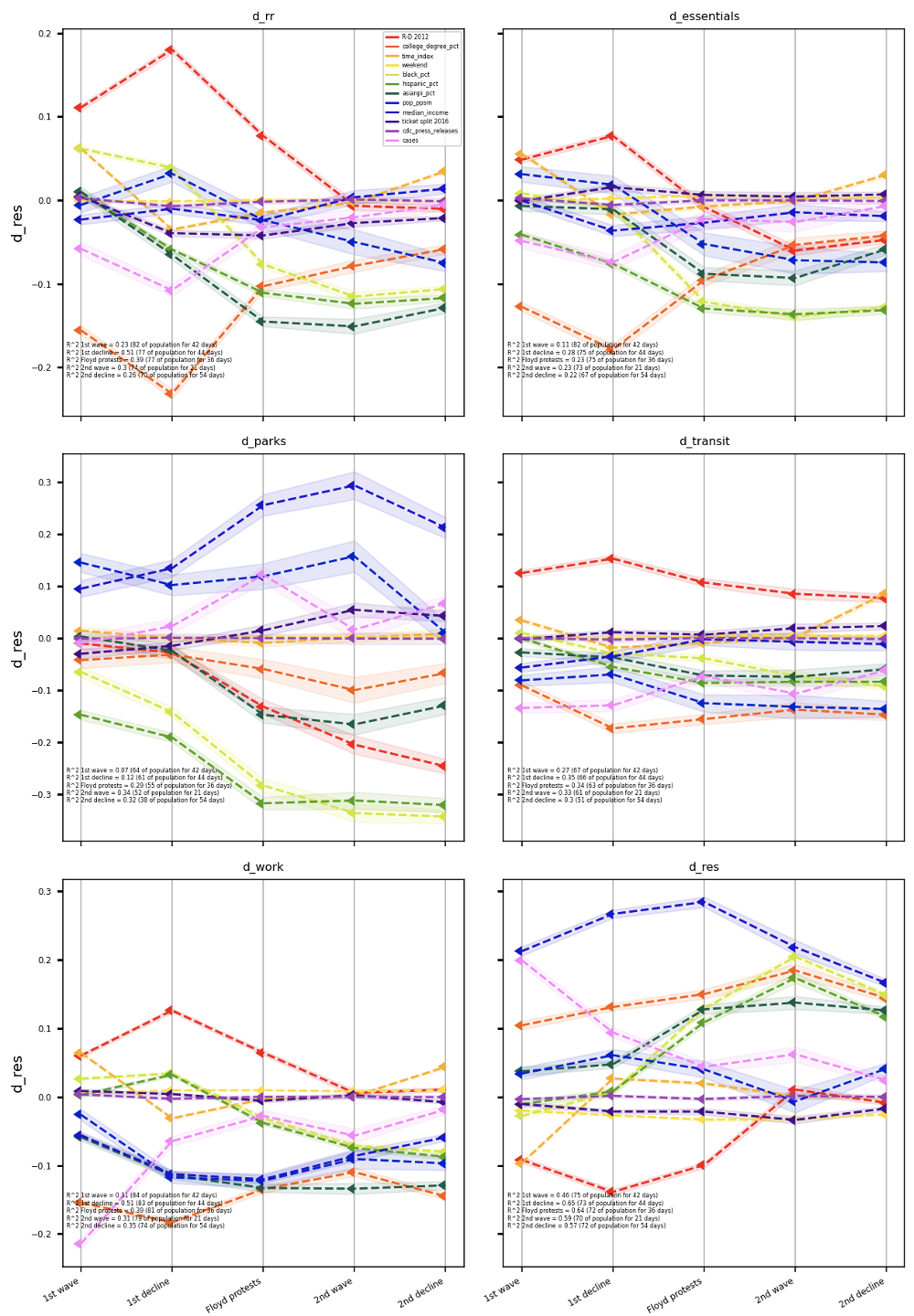
Figure 3: Shrinkage in Ideology’s Effect over Time. Coefficients of key indicators as they relate to the various types of mobility over the 5 periods of the COVID-19 pandemic. The effect of ideology on mobility nearly vanishes as the pandemic persists. For instance, the effect of ideology on Residential mobility (i.e., time stayed at home) in 2nd Decline is indistinguishable from zero and is more than 90% smaller in effect size than in 1st Decline.

Figure 4: Predicted Values for the Effect of Political Partisanship on COVID-19 Growth Rate – the 3D plain indicates R values (on the vertical axis). Green sections indicate lower R values. Red sections are those where COVID-19 growth is exponential. The first horizontal axis indicates the partisanship differential in the 2016 US presidential elections, ranging from -1 (the county voted overwhelmingly for Hillary Clinton) to +1 (overwhelming vote for Trump). The second horizontal axis indicates % under 24. The different panels present bottom quarter income levels (top left) to top quarter income (bottom right).

Figure 5: COVID-19 hotspots and election differentials – On the left is a map representing the voting differentials by county between the presidential elections in 2020 and in 2016. Trending red are those counties where Trump gained votes and blue are the ones where he lost votes compared to 2016. White counties are those with no meaningful change in voting patterns. The map on the right indicates the R coefficient in each county on Election Day. In green counties, the pandemic is largely under control. It is rampant, however, in those counties painted in red.

Figure 6: Variance between States in Usage of Vaccination Doses (May 2021)

Figure 7: Distribution of County-Level Vaccination Rates (May 2021)

Figure 8: Recalcitrant Counties and their Vaccination Trends (May 2021)